rollin’ – Practice better, together

rollin’ is a peaceful, skill-enhancing practice community guided by professional violinists.
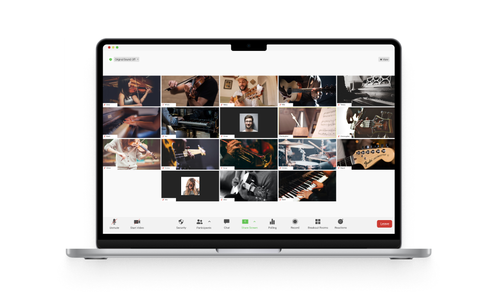
Lab 201 was requested to reinforce rollin’ customer experience on their website. rollin’ is a peaceful, skill-enhancing practice community guided by professional violinists Gabe Bolkosky and Steffani Kitayama. The previous website was built on a Wordpress theme with a handful of page depths and a 3rd party scheduling service.
Our primary goal was to minimize the total number of pages in order to have users fully focus on the overall narrative. By starting with rollin's concepts and values, walking through plans and pricing information, users eventually end up on the contact form with a clear idea of what rollin' is and how they can benefit from it. We centered rollin's landing page around capturing user intent and encouraging them to start a conversation about rollin' practice sessions via a custom contact form.
Keeping the sense of commitment around the contact form as low as possible.
Our secondary goal was to keep the sense of commitment around the contact form as low as possible. From a UX perspective, we felt like there was a relatively high hurdle, especially for free trials, in requiring account creation on a 3rd party scheduling service. Additionally, because some of the feedback sentiment was kind of a "you have to do it regularly to understand the value", our other hypothesis was that removing the hurdles for free trials could increase conversions in both trials and subscriptions. Since the stakeholders are managing practice session links and attendance manually, we thought this was a good opportunity to see how this kind of UX change effects engagement and conversion rates.
A Bright, Motivating and Friendly Path to Mindfulness
We also wanted to be specific and explain in detail about the service, since rollin’ is quite new to most of people. Our visual concepts are bright, motivating and friendly vibes, using bright colors to be mindful of the target demographic which is from teenager to retiree. Having a strong header that depicts the product or service offered is step one to have users to stay on the website and continue to learn more about the product. We chose an illustration that embodies connectedness, with the swirly line in the header represent the rollin’ service in a glance, while our design of logotype prioritizes legibility and familiarity.
Check out rollin’ and experience the mindfulness in practice!
